Patient First
A user experience research case study conducted to identify areas of improvement within the Canadian Healthcare System.
Project Overview
This UX Research Project was one that came with a few notables in order to complete it within a 3-week timeframe.
Role
UX Designer
Tools
InVision, POP, Sketch, Zoom, Microsoft Office
Time Frame
3 Weeks
Constraints
-
Must recruit candidates that meet research criteria
-
Time frame of 3 weeks from discover + research to handoff
-
Fully Remote
The Design Process
The “Double Diamond” strategy helps bring structures to the problem-solution cycle, making it easier to define problem and identify solutions. The first step in discovery was conducting research. Then to define the problem space I interviewed some users and created user persona to best capture the user perspective. The next step in the process is to then create a problem statement to target the solution.

Discovering the Problem Space
After conducting a thorough secondary research plan, the following areas of the problem space in Canada’s Healthcare system were discovered.
Current State:
-
Canadians are unaware of how much healthcare expenses as a whole costs and any ways to offset these costs
Future State:
-
To identify and redesign key areas of improvement for the Canadian patients with the many existing knowledge gaps as to what portions of healthcare are their responsibility.
Validation Through Research
Noted below are some key findings for this problem space
EXPENSE ANXT
“Few patients are confident they can afford an expensive medical bill, as high out-of- pocket healthcare costs continue to be a cause for patient concern, according to a report from the Commonwealth Fund.”
-patientengagementhit.com
COVERAGE LIMITATION
“Hidden Canadian Healthcare Costs- Canada’s universal healthcare system doesn’t offer universal drug coverage. Only about one-third of the population is eligible for government drug programs in Canada — the rest pay cash or have private insurance.”
-fraiserinstitute.com
DECISION RESTRICTIONS
“Many cancer patients don’t realize that chemotherapy may only be covered if it’s performed in a hospital—if you opt to take it in pill form, either for convenience or due to an aversion to needles, you may have to pay up to thousands of dollars per week.”
-Oma Insurance
Hypothesis and Assumptions
Hypothesis
The purpose of conducting my research is to prove my hypothesis-Peripheral healthcare costs consistently surprise and disappoint working Canadians. I will prove this to be true through my interviews with professional working Canadians who have access to and have utilized private insurance and that the included assumptions are true.
Assumptions
-
Canadians have paid out of pocket costs for a portion of their prescriptions and medical procedures
-
They are unaware of what costs are their responsibility.
-
They needed to plan for unexpected medical procedures, due to lack of full coverage
How might we address the knowledge gap Canadians have for unexpected medical costs so that they can plan for the future and be financially prepared?
Research Objectives
-
To prove my assumptions to be true or untrue
-
To understand a patient’s pain points and view opportunities for a potential solution
-
To view if my hypothesis can be proven true or untrue
Research Methods
-
Virtual User Interviews
-
Recruitment Method- Network through connections and phone call
-
Schedule of Interviews: Friday August 28, 2020; interviews from 7pm-11:45pm
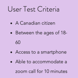
Participant Criteria
-
Current working professional in Canada
-
Access to private insurance
-
Had undergone a medical procedure within the last five years.
-
Can be interviewed via zoom or phone call
-
Able to schedule 20-30 minutes for interview
“Canadians are in constant search for a resource to help them plan out their medical and financial needs simultaneously.”
“Patients needed to plan for unexpected medical procedures, due to lack of full coverage.”
Almost all procedures result in the patient paying out of pocket to some extent
There exist many areas of improvement for the patient experience, ranging from unanticipated payments and lack of coverage to general lack of knowledge and issues onboarding patients
Despite the above findings, there is still a generally positive reputation of Canadian healthcare.

Establishing Epics from User Stories
In order to establish what tasks a user like Maryam would find the most value in for this app, user stories of what she would hope to accomplish were created. Once all possible options were noted, they were then grouped into categories called “Epics” to decipher between which choices would add the best value to her.

Identifying the Key Epic – Financially Planning for Healthcare Procedures
It was made clear in the secondary research, interviews and user stories that two pain points someone like Maryam had the stress of going through a procedure and figuring out how to financially handle the responsibility of it. This became the focal point to adhere to in the next phase of the design process and provided direction when going into the ideation phase of the design process.
Establishing A Core Task Flow
Now that the app had a focal point, the knowledge obtained from all research was then used to create a primary task flow.
This task flow demonstrates two different user stories from the Epic “Financial Planning for Healthcare Procedures”: getting online resources, and payment options available- assuming that the user has already established a profile and has logged in to land on the search page is in effect
Initial User Flow
For our user, Maryam Tanus, this task flow was illustrated to best assist her with her situation needing a wisdom teeth procedure performed.
The diagram demonstrating her ability in a system decision to filter payment options and find a healthcare clinic that could adhere to her financial and procedural needs is a key element for consideration for all users that is kept in mind for this app.
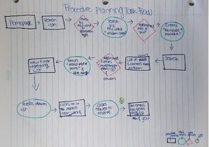
A Notable Pivot
This pivot entailed the task flow diagram. Initially, the task flow of a payment app such as AirBnB was consulted for payment inspiration as to what a user would expect out of an app. However, when finalizing the task flow, the system design needed to be purely task oriented with different possible outcomes based on the user’s decisions, not just the screens they would expect to encounter.

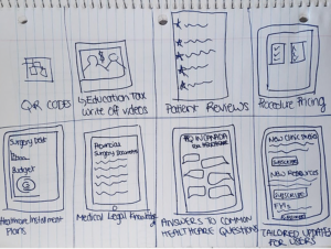
Sketches & Ideation
The next steps in the design process were to sketch out all possible ideas and to then create digital prototypes to test on users. After two rounds of testing and iterations after each round based on prioritized feedback with various users, the prototype was taken from a lo fi concept to a higher scaled mid fi in order to then search for UI inspiration to capture the sense of calm and aid that the healthcare industry strives for it’s patients to experience.
Ideation Interaction
My initial sketches for this app were completed with the “crazy eights” exercise. This in tern allowed me to be able to in a minute, express all raw ideas for the digital solution
Initial User Flow Diagram
The next phase of my project demonstrated lo-fi sketches in order to organize information architecture and to find a seamless interface for users to be able to navigate without any instruction.
POP App Demonstration and Feedback
Once the ideation was completed with initial concept sketches like crazy eights and some lo fi wireframes, an initial user test in the POP app was completed for some concept validation.
After the initial user test was completed, the following feedback was received;
“I really like the concept, it’s a great idea overall.”
“I have a child so I think a growth chart would be helpful for me to determine by the child’s age what the average for their age is.”
Although that feedback is definitely valuable and useful for a potential persona parent, that was designated as a secondary feature to cater to parents of younger children. The feedback was noted and was decided to be considered at a different priority level.

Prototyping & User Testing
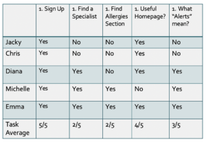
Round 1 user testing and feedback
After initial testing, many users had the same comments and some had surprising actions.
“I am confused with what the skip button is for”– this was a prime example of a layout needing to immediately be corrected in order to avoid confusion with the most successful task, signing in.
A few other areas noted to require change in the feedback were:
-
The “New Discoveries” Wording
-
The double search capabilities within a screen
-
The need for a back button or breadcrumbs
-
A preference for notifications
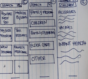
Version 1 screen vs version 2 screen of changes
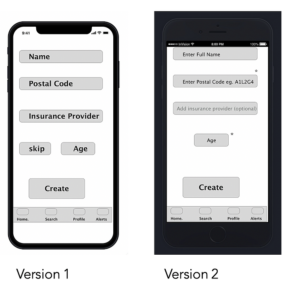
Due to user feedback and testing, the following changes were made to the LO FI prototype:
-
Improving the task flow when a user signed up was made high priority
-
Removing the double search bar in the home screen to avoid confusion was then completed
-
Finally removing the “skip” button was done as it was not well received in the testing phase.
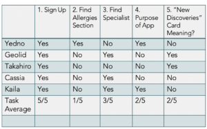
Round 2 user testing and feedback
After secondary testing, many users had varying comments and some had surprising behavior.
This test round, a lot of the wording of cards on the home page, bottom navigation tools or a specific task like in the “finding allergies resources” area were enough for users.
A lot of feedback was given for ease of scan lacking and visual hierarchy for what they would opt to use in this tool first.
All noted feedback was useful and prioritized for the next and up to date prototype.
Version 2 to Current Version Comparison
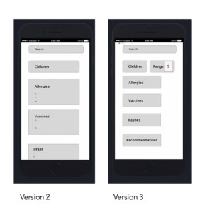
After secondary testing, many users had varying comments and some had surprising behavior.
This test round, a lot of the wording of cards on the home page, bottom navigation tools or a specific task like in the “finding allergies resources” area were enough for users.
A lot of feedback was given for ease of scan lacking and visual hierarchy for what they would opt to use in this tool first.
All noted feedback was useful and prioritized for the next and up to date prototype.
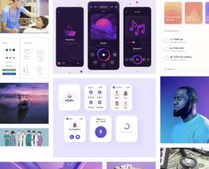
UI Inspiration board
UI Elements
Here we are going to start with app specific features that would ideally be great sources of inspiration and components to use within the app. The colors chosen are to strategically be placed throughout various components of the app. Ideally, accents of blues and texts of purple will be demonstrated to continue the values of healing and serenity
Patient Anxiety
Here, a huge inspiration for me was the knowledge gaps patients face. Sometimes, they feel panicked, like Maryam when she realizes she will need to account for the out of pocket expenses her procedure would entail.

Patient First Inspiration Board
I sought out to find images and colours that represent a sense of calm and ease for users, which is why the mood board demonstrates very gradient transitions of blue and purple hues, I also wanted to ensure that core values of a patient’s healing being a priority were represented, as demonstrated in the quote included, and finally, I wanted to ensure that there was a sense of humor and overcoming stress (see if you can identify the celebrity meditating included).

Next Steps
The next steps would be implementing the UI elements and color themes outlined in the mood board, to then bring the prototype into a hi-fi design. I would then proceed to conduct round three testing and continue to iterate once user feedback is received to continue the process to continue creating a digital solution for Canadians.
Key Learning
As the sole UX designer for a research case study in the healthcare field, I was so surprised. As a native Canadian, I was shocked to discover the many problem areas that existed within the healthcare system. This case study completed over three weeks will all increments of research was one that revealed how valuable designing for the patient experience on multiple avenues is. There are many areas of miscommunication that can be solved with a digital solution and to help the process both experienced by a patient and conducted by a healthcare professional go smoothly.
Reflecting on this process, the amount of research and strategy to identify the best course of action to design for a problem space was something I learned as a designer that I have a passion for. This role doesn’t purely entail ensuring that someone can view a product that meets design trends or accessibility standards alone. This role is one that involves being a calculated decision maker, impartial yet empathetic throughout the design process and most importantly to “embrace the ambiguity”. Even in the research phase of identifying a problem space, it is possible to have your assumptions or hypothesis proven UNTRUE or to uncover additional factors to a problem space that need to be taken into consideration.
My final take away from this project is there is a whole area in healthcare and technology that can really benefit from UX design principles and going forward, I plan to apply this knowledge towards more of these projects. This experience has exposed me to a new area that I have become eager to learn more about and passionate to design for, patients and healthcare professionals